Brand
Making something for us
Everything you need to produce work that looks like it came from us: the files, the colors, the type, and the small number of rules that actually matter. If something here is not clear or you need a format that is not in the pack, email me rather than working around it.
16 SVG · 16 PNG · README · ~540 KB
Read this part
Six rules, and the rest is detail
- 01Never put the mark next to the wordmark.The three bars and the lockup are alternatives, not a pair. Pick one. Everything else on this page assumes you have.
- 02A coral field always takes dark ink.White on coral measures 2.8:1 and washes out on a phone in daylight. Use black, or the dark green-black.
- 03The logo coral is always #FF6A4D.On light and dark alike. There is a darker red in the palette for body text on light grounds — it must never touch the logo.
- 04Clear space is the height of the coral GTM block.On all four sides. It scales with the logo, so there is one number and it is never wrong.
- 05Do not go below 121px wide, or 16px for the mark.That is measured, not taste — it is where the letters stop resolving. If the space is smaller, use the mark instead of shrinking the lockup.
- 06Do not stretch, skew, rotate, recolor or rebuild anything.Scale uniformly. The geometry is specific, and a rebuilt version will be visibly off. If you need something the pack does not have, ask.
Files
Start with the first two
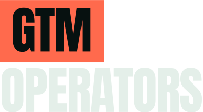
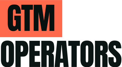
wordmark-primary for dark backgrounds and wordmark-light for light ones cover almost every case. Each tile below sits on the ground that file is built for.
Two color · the default




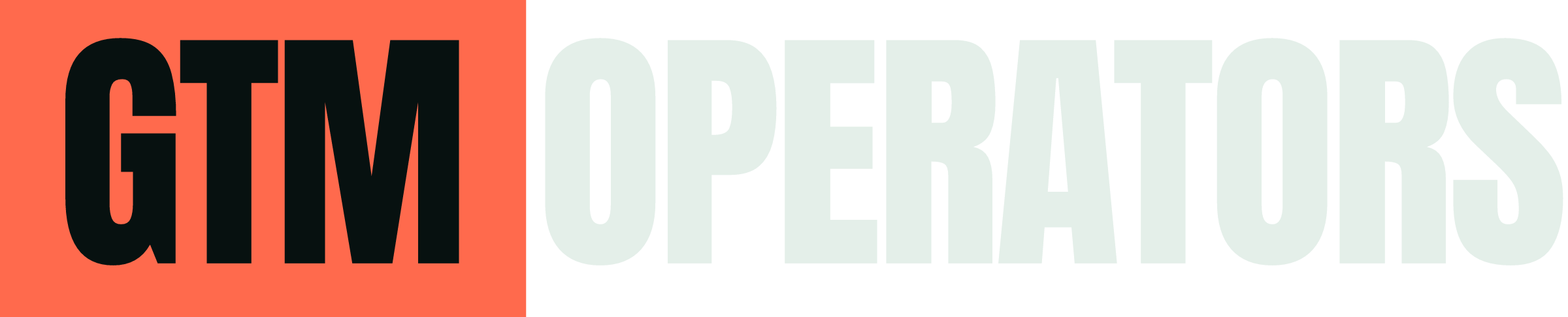
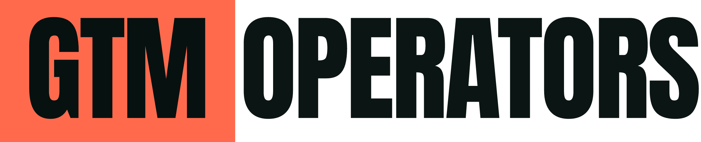
One color · the letters are real holes
These are cut out rather than filled, so whatever sits behind them shows through. Use them when you only get one ink.












No EPS or AI in the pack.
The SVGs open in Illustrator and After Effects directly, and the letters are already outlined so you do not need the font. If your workflow genuinely needs a different format, ask and I will make it rather than have you convert one.
Spacing
One measurement, and it scales
The dashed line is the logo’s own bounding box. The clear space around it is the height of the coral block — keep everything, including page edges, outside it.
Color
Coral never means damage
Coral is emphasis, decisions, and things we built. Crimson is the only color that means something is broken. They are different hues on purpose, so both can appear in one frame without confusing anyone.
| Name | Hex | RGB | Use | |
|---|---|---|---|---|
| Ground | #071110 | 7, 17, 16 | The near-black. Our default ground | |
| Coral | #FF6A4D | 255, 106, 77 | The brand color | |
| Bone | #E4EFE9 | 228, 239, 233 | Our light ink. Not pure white | |
| Mint | #4FD6AE | 79, 214, 174 | Working | |
| Amber | #F0B44E | 240, 180, 78 | Degraded | |
| Crimson | #FF2E5F | 255, 46, 95 | Broken | |
| Slate | #6E9BC4 | 110, 155, 196 | Links, secondary accents |
These are screen values. No CMYK or Pantone has been specified — ask before converting anything for print.
Type
Three faces, all in the pack
All three ship in fonts/ as static single-weight TrueType, which is what Adobe apps and most video tools want. They are SIL Open Font License, and the license text sits beside them — it has to travel with the fonts if you pass them on.
Display. Always uppercase, always 0 letter-spacing, never below 20px. Do not add tracking as it gets smaller — it is drawn to be set solid.
Google FontsLabels, timecodes, stats, captions. Uppercase with +0.14em letter-spacing.
Google FontsThe logo is set tighter than the headlines.
The lockup uses -0.022em. That value belongs to the logo only and should never be carried into a headline — the display scale is flat at 0.
For video and motion
Left to right, or it grows, or it does not happen
Signal enters on the left and value leaves on the right. The direction is the entire idea, so movement that goes the other way reads as wrong even to someone who cannot say why.
| Duration | For |
|---|---|
| 120ms | State feedback |
| 200ms | Hover, small reactions |
| 320ms | The default. Anything entering |
| 600ms | Something meant to be watched |
| Easing | For |
|---|---|
| cubic-bezier(0.16, 1, 0.3, 1) | Entering |
| cubic-bezier(0.7, 0, 0.84, 0) | Leaving |
| cubic-bezier(0.65, 0, 0.35, 1) | Color changes and travel |
The logo animates exactly one way.
The three bars rise in sequence, left to right. That is the only permitted logo animation. No spinning, no bouncing, no letter-by-letter reveal on the wordmark, no flares, no particles, no unfolding.
And if a still frame from the animation does not make the point on its own, the motion is decorating a weak shot. Decks get exported to PDF and animations get screenshotted.
The gain field — usable as a transition, wipe or lower-third rule
If you are writing copy
Specific beats clever
Open with the claim, then enumerate. Fragments are fine. Show the failure before the fix. Name real tools and real numbers — this audience runs these systems, and vagueness reads as inexperience.
leverage · unlock · supercharge · 10x · “in today’s landscape” · maturity curve · transformation journey · game-changer · seamless · robust · best-in-class · synergy
American English throughout. Optimize, color, analyze, center. Dates as “August 21, 2026”.
Ask before you work around something
A format you need, a layout the rules do not cover, a case where two of them conflict. Any of those is a two-minute email and a much bigger problem if it gets guessed at instead.